The problem
Most of us have probably dealt with transportation bookings before, and it was most likely when we were preparing for a vacation, take a trip somewhere. Unlike business travelers, whose bookings were usually made by their companies and therefore high prices wouldn’t really mattered for them, tourists are almost always concern about transportation expenses (as well as any other expense for the trip).
I can see there’s room for improvements in this problem space.
PROBLEMS #1
Transport methods other than flights
When we think about a vacation, usually the first thing comes to our minds is flight tickets. This is perfectly reasonable, as desires for faraway trips are much higher than nearby locations. Many sites and platforms have grown tremendously by helping people find the cheapest possible flight tickets for their trips.
However, in places such as Europe, with an incredibly efficient network of interconnected highways and train rails, flights are not always the cheapest (and sometimes not the fastest) way of traveling. Furthermore, buses and trains stations are almost always closer to cities’ centers than airports!
PROBLEMS #2
Connect multiple transport methods
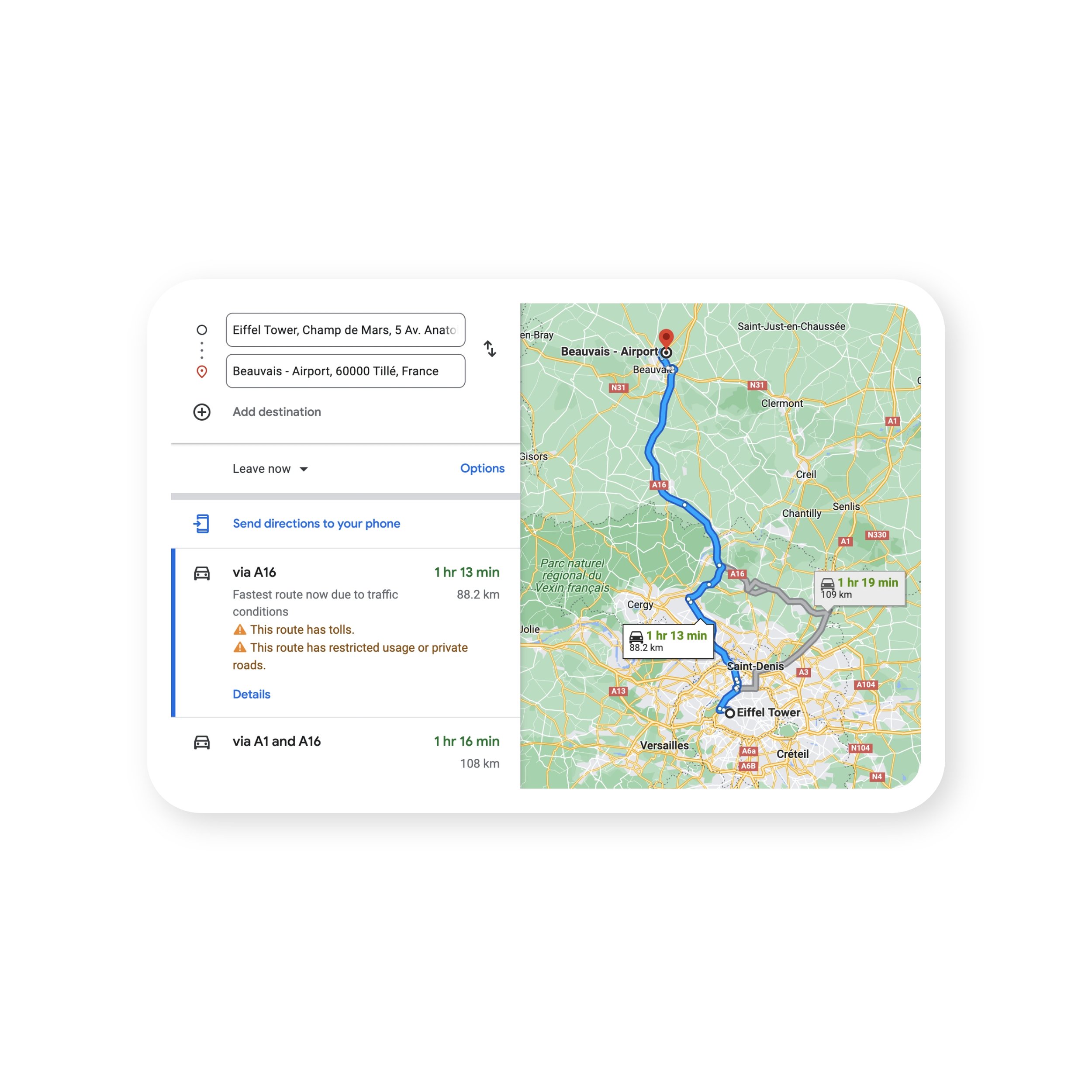
Budget airlines are usually avoid busy and popular airports. For examples, Ryanair will land at Luton, Stansted or Gatwick, instead of Heathrow in London, or Beauvais instead of Charles de Gaulle in Paris.
Here is an example based on my own experience: I’m based in Helsinki, and would like to visit Gdansk in Poland. If I search for flights from Helsinki to Poland on Momondo, the cheapest offer it can find is 107€, which includes 1 stop on the outbound trip, and 2 stops on the return trip. Outbound trip take 4 hours, return trip takes 13 hours, all 3 stops are self-transfer, and one of them is 6 hours long.
However instead, if I searched for flights from Turku to Gdansk, then I’ll get a direct flight both ways, no transit, 1.5 hour long each, for 29€ in total.
Factor in bus tickets to reach Turku from Helsinki for 18.80€ both ways, and it’s 47.8€, more than half the price of HEL-GDN, and significantly faster!
discoverability
The problem here is discoverability, as many people don’t even aware of other available routes, don’t know where to look for them, and don’t have a clear view of comparison between routes, such as durations, prices, departure / arrival locations, ...
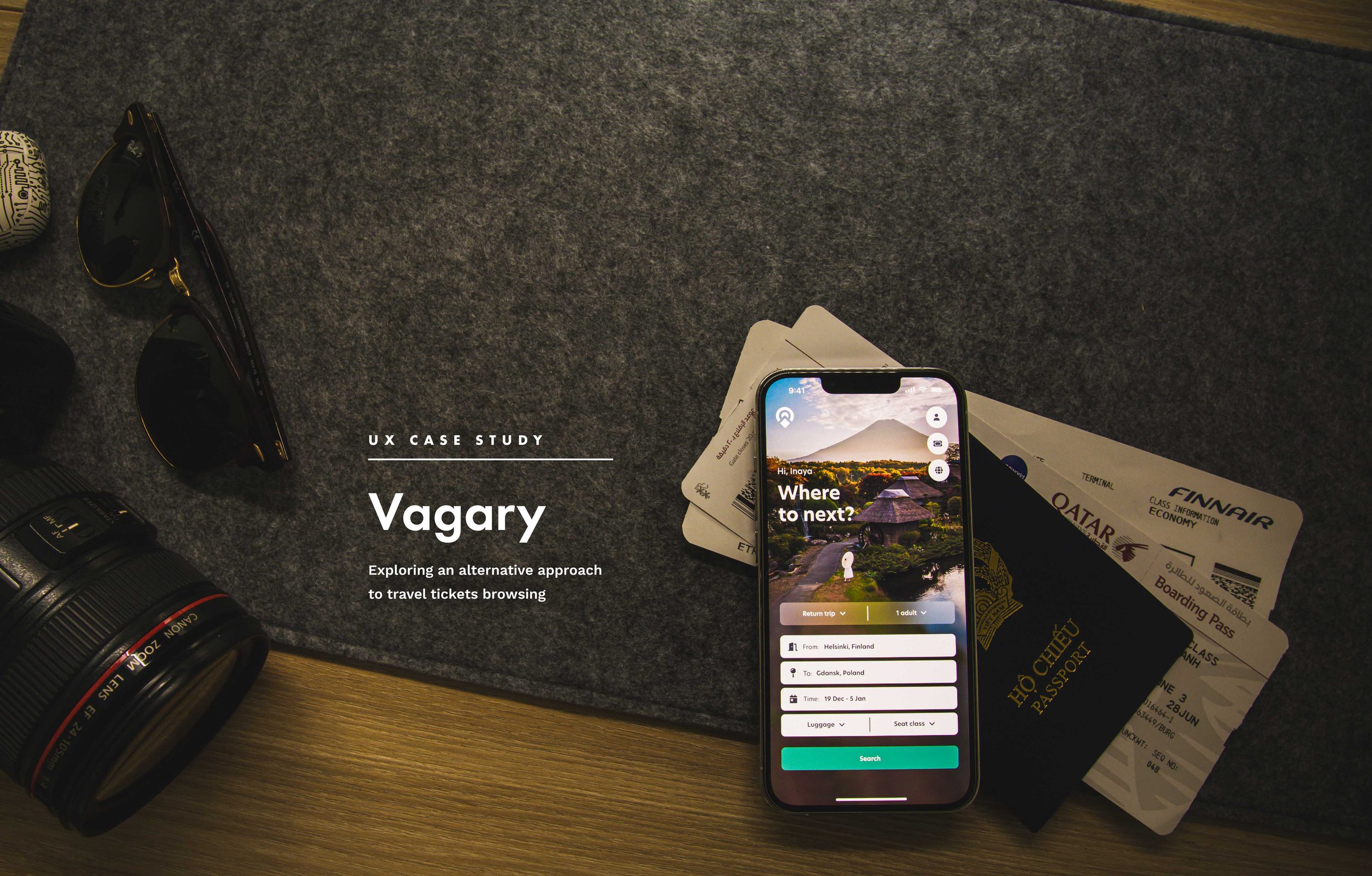
Vagary
I turn this problem into an opportunity to reimagine and design a solution: Vagary - the one platform that let you find the most ideal ticket to reach your destination.
Also with Vagary, I aimed to enhance the traveling experiences, conduct user researches to discover pain points, and try to fix them.
Project Info
Personal Design Project
What I do
User research, market research, User Experience design, Visual design, Brand Identity design
Tools
Adobe XD, Overflow, Illustrator & Photoshop
You can find the fastest route, the cheapest route, or somewhere in between.
Vagary looks for and compares not only flights, but also trains, buses and other available methods.
Vagary even goes even further by trying to connect different transport methods in order to create cheaper and/or faster routes for you!
Vagary will guide you through every step of your journey.
Competitive Analysis
We researched into the market to see whether existing tools & platforms can help trainers streamline their workflow. Here’re our findings:
Pros
Home screen is very dynamic, based on users interests and recent searches to fetch contents that inspire new destinations
Very extensive prices analyzer
UIs and user flow are clean and information is presented neatly, easy to understand
Cons
Compared to the web app, recommended contents and functions are far less on the mobile app
Regional / domestic providers are limited to regional sites. Prices for abroad itineraries which were outside of user’s region are usually worse. User needs to use its regional site to get the best possible prices.
Pros
Destinations exploring flow is very intuitive and inviting User flow overall is very neat and quick
Overall prices are displayed for each day right from the dates picking screen
Cons
Can only search for flights
Pros
An onboarding flow to get to know the user
An minimal home screen that focuses on searching right away
Date picking screen is easy to understand and use
Overall prices are displayed for each day right from the dates picking screen
Cons
UIs don’t have a clear hierarchy
In search results, itineraries preview cards seems too messy and hard to read. Also, call-to-action of each itinerary is not too obvious
Understanding the problem
As a product designer, I just cannot design a product only for myself. I cannot assume that the problem I discovered is a widespread problem that many others also encountered.
First, I wanted to get a clear picture of how people browse and look for travel tickets when there are constraints to adapt, more specifically prices and speeds. Then I also wanted to discover pain points that people are having while traveling, and see if Vagary can provide any help with.
Here’s a summary of my findings:
55%
would pay for a more expensive itinerary in order to avoid transits that are 4 hours or more
19%
would willing to pay even more in order to fly directly
People just don't like long transit. And turns out, people don’t feel safe and comfortable when waiting around at the airport.
34%
would take trains or buses if the trip only takes slightly longer (under 2 hours longer)
8%
would avoid flights if they can because they just don’t like flying at all
It’s not just because of possible cheaper prices, it’s also the scenery that they can enjoy on trains and buses.
17%
aware of the fact that budget airlines avoiding big cities and offer significantly cheaper flights between smaller cities pairs
42%
are willing to actually take buses / trains to smaller cities in order to take such flights, if the total travel time is not much longer, and the price is significantly cheaper
At airports / stations, touchpoints such as info-screens are increasing peoples’ anxiety. The reason could be that there are so many flights to be presented on the screen, and people have to carefully search on the screen for their flight. Gates / terminal changing will worsen their feeling even more.
24%
does not actually know specifically what to do next while changing planes or trains, and needed to ask for help from people nearby
Goals
Based on my user researches and competitive analysis, I defined what would success looks like for this project. Here’s the goals I prioritized:
Search for results of not just flights, but also buses, trains and other available methods. This is so that users have a clear view, and can compare different itineraries.
Connect different transport methods where reasonable, in order to create cheaper and / or faster itineraries. Then present information in a way that user can easily comprehend.
Rethink and improve the tickets booking flow as well as provide assistances to users while they are on the trip.
The Designs
“Good design, when done well, should be invisible.” - Jared Spool
I tried my best to follow this design philosophy. My users should spend the least amount of time and effort on the app. I kept the customer journey, as well as all the interactions to the absolutely minimum and easiest to understand, without sacrificing usability or intuitiveness.
Although short and quick, but through many prototypes, user testings, feedbacks and iterations, the user flow is designed so that the right information and actions show up at the right place, at the right time, when users need it the most.
Here’s the details of my designs:
After analyzing a few competitors, I can see that many of them are under-utilizing their landing screens.
For Vagary, I tapped into my knowledge in photography, and integrated landscape beauty into the layout. It makes the UI more lively and brings inspiration.
Wherever possible, I merged multiple inputs into a same interaction, but made sure users have all the necessary filters to setup before the search.
I really like the 2-taps method that Kiwi is using for their Dates selecting flow, therefore I applied it to my design.
Departure and return dates can be set from one same screen. The first tap on the calendar will set the departure date, and the second tap will set the return.
Average prices for the return trip can be quickly fetched right after the departure date is set, so that users can consider which day is cheap to return.
In places such as Europe, with an incredibly efficient network of interconnected highways and train rails, flights are not always the cheapest (and sometimes not the fastest) way of traveling.
One of primary goals for Vagary is to look for all possible routes and transport methods, and give users a clear view to compare and pick a suitable itinerary.
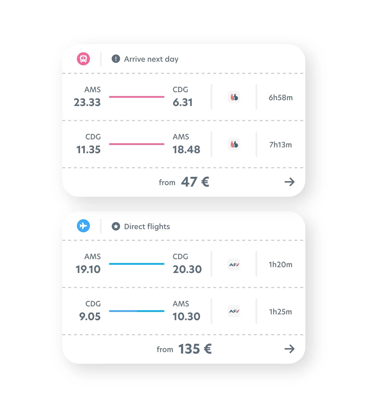
Present different types of itineraries in a single, linear level is quite tricky. I applied some color coding here to differentiate them.
To avoid distraction from the search results, I tried to
keep the top bar as minimal as possible, without compromising on usability: all filters are bundled into a toggle, and users can change the itinerary details also with one tap.
It’s not an easy feat to determine what information to present at each view. After a few rounds of testings, feedbacks and iterations, I finalized with this set of information in each itinerary preview card.
Color coding becomes even more useful when it comes to connecting different transport methods in one itinerary.
The goal is to not confuse users, but at the same time make it clear that users are going to ride in multiple types of transport from home to the destination. While doing that, I had to also maintain styling consistency.
Of course, multiple transport methods introduce more complexity, especially in the connecting part.
I made sure the itinerary details screen laid out information and each step clearly. This is also to ease users’ anxiety and reinforce their booking decision.
After the user booked the tickets, it’s not yet the end of the usefulness of the app.
In combination with notification push, the Journey Assist screen will keep user up-to-date with all necessary information and preparations needed.
One of the main goals of Vagary is to connect different transport methods, in order to create a cheaper and / or faster itineraries. However, how people transit between an airport and a train/bus station varied greatly at each city.
Therefore, while traveling, the app will assist users at each step of the journey, with the information carefully tailored for each scenario.
In this example, user just arrived at Turku bus station. The app will present information of how to get to Turku Airport to catch the next flight, like how far away is the airport, next flight leaves at which time, is public transport available and leave at which time, and is there a taxi option?
The right information show up at the right place, at the right time, when users need it the most.
The Journey Assist screen should fetch information and update them in realtime, such as gates changing or delays.
When the user is at the airport or bus/train station,
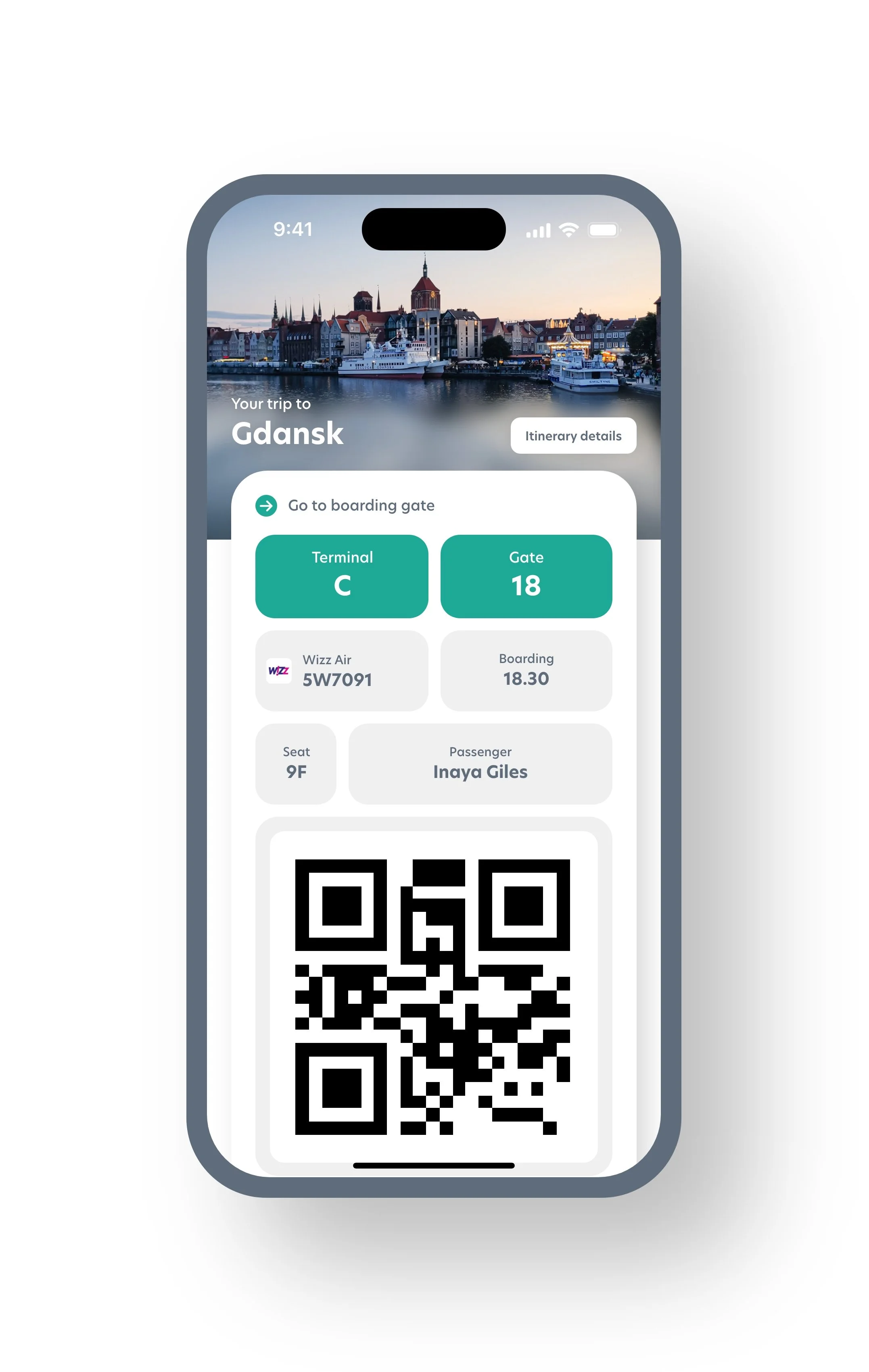
the ticket that they are about to use for boarding will be present at the forefront.
I designed a ticket layout that minimized excess details, and prioritized the info that can help users to find ways and navigate through airports / stations, to get to their gates.
For example in flight tickets, I prioritized terminal and gate number on top, and then flight number and boarding time. Seat number, passenger name and ticket QR code are also visible before scrolling.
However, I left the booking number at the bottom (which requires scrolling), based on my surveys telling that booking number is not a meaningful info while users are already at the airport (and already checked in).
Personal Takeaways
Here’re some personal takeaways for me from this project:
Empathize with the users
Through field trips, user interviews and testings, you put yourself in the shoe of the user. Try to understand their experiences, their emotions, and look through their lens. This understanding is one of the foundations for creating thoughtful designs, that resonate deeply with the users and effectively resolve their struggles.
Collaboration makes great designs
At every stage of the process, collaborate with people from different positions, backgrounds and disciplines. By doing that, you would be able to look at problems from multiple angles, see the larger picture, and find a way to tackle tricky, complex problems.


